
Kitchen Colour as per Vastu: A Direction Wise Guide to Walls, Slabs, Cabinets and Tiles
In This Article
Traditional Vastu links the kitchen to one element, fire, and to one zone, the south-east. Almost every piece of kitchen colour advice starts from that link. This guide sets out what contemporary Vastu guides recommend for kitchen walls, slabs, cabinets and tiles, where those guides disagree, what the classical texts actually say, and how to weigh all of it against lighting, cleaning and everyday use.
Which colour is best for a kitchen as per Vastu?
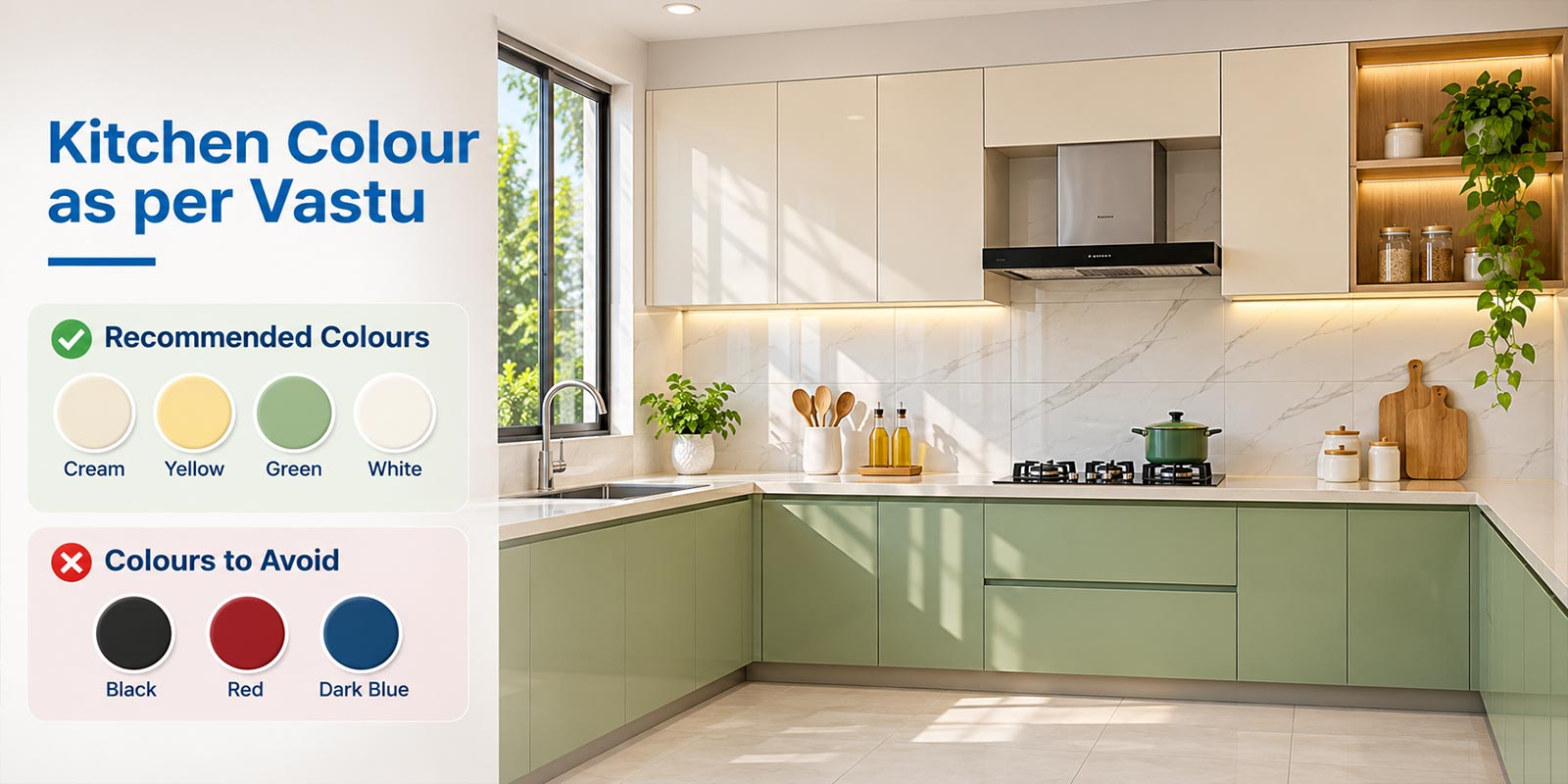
Most contemporary Vastu guides recommend warm, light colours for a kitchen: cream, light yellow, peach and soft orange. The reason given is that traditional Vastu places the kitchen in the south-east, the zone of fire. Red is usually advised as an accent rather than a main wall colour, and black and dark blue are commonly discouraged. Recommendations change with the kitchen’s direction.
Disclaimer: Vastu Shastra is a traditional system of architectural beliefs and practices. Kitchen colour recommendations may vary across texts, practitioners, and regional traditions. These suggestions are intended for general informational and design inspiration purposes and are not scientifically established methods for improving health, wealth, or well-being. Choose kitchen colours based on personal preferences, functionality, lighting, and practical design requirements.
Kitchen Colours as per Vastu at a Glance
The table below summarises the colours contemporary Vastu guides recommend most often for each kitchen surface. Direction-specific advice follows later in the guide.
| Surface | Colours most often recommended | Commonly discouraged | Practical note |
| Walls | Cream, light yellow, peach, soft orange; red as an accent | Black, dark blue or dark grey as the main colour | Light colours reflect more light, which matters most in small kitchens |
| Slab or platform | Green, brown, maroon, beige or cream, depending on direction | Black (contested; see the slab section) | Choose a stone that resists acids and oil first, then pick the colour |
| Cabinets | Wood tones, cream, white; warm colours as accents | Large areas of black or dark blue | Dark high-gloss shutters show fingerprints and smudges the most |
| Floor tiles | Beige, cream, light brown, sand; white | Black, dark grey | Use a matt or textured finish on the floor |
| Wall tiles and backsplash | Cream, white, peach, light green, soft mustard | Dark blue, black | Glossy wall tiles wipe clean easily behind the hob and sink |
| Ceiling | White or a very light neutral | Dark colours | A light ceiling spreads light evenly across the room |
Why Does Kitchen Colour Matter in Vastu?
Vastu Shastra organises a home by direction. In the system most practitioners follow today, each zone is linked with one of the five elements, or pancha bhuta: earth, water, fire, air and space. The south-east, called Agneya after Agni, the fire deity, is the fire zone. Because cooking is the household’s fire activity, traditional guidance places the kitchen there.
Colour advice extends the same logic. Warm colours are said to support the fire element. Colours that contemporary charts associate with water, mainly blue and black, are said to oppose it. Most kitchen colour rules you will read are built on that one idea.
Two points are worth stating plainly. First, the colour rules are a contemporary layer: the classical texts address where the kitchen goes, not what colour it is painted. Second, the reasoning is symbolic. No colour has been shown to improve health, wealth or family harmony.
First, Check Which Zone Your Kitchen Is In
In Vastu writing, a “south-east kitchen” means a kitchen located in the south-east zone of the house, measured from the centre of the plan. It does not mean the direction the kitchen window or door faces. Many online guides mix the two. This guide uses location throughout, so an “east kitchen” is a kitchen in the east zone.
Placement comes before colour in traditional guidance. The south-east is the preferred kitchen zone and the north-west is the accepted second choice, as explained in our guides to south east facing house Vastu and north west facing house Vastu. In a flat, where the kitchen position is fixed, see Vastu for flats and apartments.
What the Classical Texts Say About Kitchen Colour?
The kitchen’s place is attested in older texts. A colour for the kitchen is not, at least in the texts reviewed for this guide.
The Kitchen’s Place: The South-East
- The Agni Purana (chapter 105, verses 28 to 29, in N. Gangadharan’s translation) places the kitchen in the south-east, alongside the washing and fragrance chambers. The chapter does not prescribe a colour for any room or wall.
- The Kashyapa Shilpa (chapter 43, verse 69), a text on temple complexes, puts the kitchen (pacanalaya) in the place of Agni, the south-east.
Where Today’s Colour Rules Come From?
The colour associations used in modern kitchen guides draw on two other bodies of tradition, neither of them architectural.
- Planetary lords of the directions. The Narada Purana (Purva-bhaga, chapter 55, verses 16 to 17, in G. V. Tagare’s translation) names the lords of the eight quarters, starting from the east, as the Sun, Venus, Mars, Rahu, Saturn, the Moon, Mercury and Jupiter. The same passage gives the planets’ colours: copper for the Sun, white for the Moon, deep red for Mars, green for Mercury, yellow for Jupiter, variegated for Venus and jet black for Saturn.
- Element colours. Older tattva traditions give each element a colour. The Shiva Svarodaya, for example, describes earth as yellow, water as white, fire as blood-red, air as black and space as many-coloured. Contemporary Vastu charts usually give water as blue or black and air as green or grey, so the modern scheme differs from this older one.
Why Sources Disagree About the South-East Kitchen?
Read through these two traditions, the south-east points to different colours:
| Basis of the rule | Colour it suggests for the south-east | Where you will see it |
| Element of the zone: fire | Red, orange, pink | Most contemporary kitchen colour guides |
| Planetary lord of the zone: Venus | White (Garuda Purana, chapter 101) or variegated (Narada Purana, chapter 55) | Guidance that favours white or cream with warm accents |
A guide that recommends cream walls with orange accents and a guide that recommends a red kitchen are both following a traditional logic. They are reading different traditions. Neither is a classical rule for kitchen colour.
Kitchen Colours According to Direction
The table summarises the colours contemporary Vastu guides list most often for a kitchen in each zone. The last column flags where those guides contradict each other, so you can see which recommendations are settled and which are not.
| Kitchen zone | Traditional association | Colours most often recommended | Where guides disagree |
| South-east (Agneya): preferred zone | Agni, fire; Venus | Orange, peach, pink, soft yellow, cream; red as an accent | Red as a main colour or only as an accent; some favour light neutrals with warm accents |
| South | Yama; Mars | Red, orange, maroon, brown, beige | Grey: some guides pair it with orange, others list it to avoid |
| North-west (Vayavya): accepted second choice | Vayu, air; Moon | White, cream, off-white, light grey, silver, pale pastels | Some suggest pairing white with light yellow or red rather than using white alone |
| East | Indra; Sun | Green, orange, beige | White and yellow: recommended by some guides, listed to avoid by others |
| West | Varuna; Saturn | White, grey, yellow or gold | Green: listed as suitable by some, to avoid by others |
| North | Kubera; Mercury | Green, especially for the slab | Most guides advise against a north kitchen; colour is offered only as mitigation |
| North-east, south-west or centre | Ishana (north-east), Nirriti (south-west), Brahmasthan (centre) | No consistent advice | Treated as a placement problem rather than a colour problem |
For the north-west, the recommendation is stable across sources, and it matches the light, cool palette traditionally favoured for that corner of the house. The east is the least settled zone: the same colours appear on both the “recommended” and “avoid” lists of different guides. If your kitchen is in the east, choose from the colours the guides agree on: green, beige and soft orange.
Kitchen Wall Colour as per Vastu
For walls, contemporary Vastu guides most often recommend cream, off-white, light yellow, peach and soft orange. For south-east and south kitchens, terracotta and brick tones also appear frequently. Red is usually suggested for a single wall, a band or accessories rather than the whole room.
- Keep the main wall colour light. Use a warm shade as the field colour and a stronger shade on one wall or the backsplash.
- Paint the ceiling white or a very light neutral. Both Vastu guides and lighting practice agree on this.
- Use a washable finish near the hob. Steam and oil mark kitchen walls faster than any other room. A finish you can wipe matters more than the exact shade.
Paint makers publish a light reflectance value (LRV) for each shade, on a scale from 0 for black to 100 for white. A higher LRV bounces more light back into the room. In a small kitchen or one with a single window, that number does more for the room than the colour family does.
Which Colour Is Best for the Kitchen Slab According to Vastu?
Slab advice is almost entirely direction-based, and the same list repeats across most guides:
| Kitchen zone | Slab colours most often recommended |
| South-east and south | Brown, maroon, green |
| East | Green, brown |
| West | Grey, yellow |
| North | Green |
| North-east | Yellow |
Neutral slabs in beige, cream or white are also suggested as a safe choice for any direction. None of the guides that publish this direction list cites a text for it.
Is a Black Granite Slab Bad as per Vastu?
This is contested. Many contemporary guides discourage black or dark grey slabs because dark colours are treated as heavy or as belonging to the water element. Other widely read guides recommend black stone or marble over granite. The texts cited for kitchen placement do not mention slab colour at all. If you like a black slab, the Vastu case against it is weak and inconsistent.
Choose the Material First
In practical terms the material matters more than the colour. Marble is calcium carbonate, so acids such as lemon juice, tamarind, vinegar and tomato etch its surface. That makes it a poor everyday work surface in an Indian kitchen, whatever its colour. Granite resists these acids far better.
Turmeric is the stain to plan for on a light slab or light grout. Turmeric contains curcumin, a natural pH indicator that stays yellow in neutral conditions and turns red in alkaline ones, such as soap or most kitchen cleaners. Wipe fresh turmeric with plain water first. If a soap-washed stain turns red, rinsing well brings it back towards yellow.
Kitchen Cabinet Colour as per Vastu
For cabinets and kitchen furniture, wood tones and brown are the colours contemporary Vastu guides recommend most often, on the reasoning that they represent the earth element and stability. Cream and white follow. For south-east and south kitchens, terracotta, orange or maroon are suggested as accents on one bank of units. For north-west kitchens, white and light grey are preferred. For east kitchens, green and wood tones are the usual suggestions.
- Two-tone cabinets work well with this guidance: a warmer or deeper colour on the lower units and a lighter colour at eye level keeps the room bright.
- Kitchen trolley colour follows the cabinet colour. Most trolley baskets are steel, so the question only applies to the outer shutter.
- Modular kitchens follow the same rules. The direction of the kitchen, not the cabinet system, drives the recommendation.
On finishes, dark high-gloss shutters show fingerprints and smudges the most, while mid-tone and textured finishes show them least. For layout options before you finalise colours, see types of kitchen layouts. Aparna Enterprises offers modular kitchen and wardrobe solutions in a range of colours and finishes.
Kitchen Tiles Colour as per Vastu
Kitchen Floor Tiles
For kitchen floors, contemporary Vastu guides most often recommend beige, cream, light brown and sand tones, and some name white as the best flooring colour. Black floor tiles are the colour most often advised against. Dark grey is also commonly discouraged.
From a practical point of view, a very light floor shows every crumb and spill, while a mid-tone beige or sand floor is more forgiving. The finish matters more than the shade: water and oil make glossy floors slippery, so choose a matt or textured finish for a kitchen floor. Our guide to kitchen floor tiles covers finishes and sizes in detail.
Kitchen Wall Tiles and Backsplash
For walls and backsplashes, the colours most often suggested are cream, white, peach, light green and soft mustard. Here a glossy finish is useful, because it wipes clean behind the hob and sink. Grout is the weak point on light tiles: a slightly darker or stain-resistant grout behind the cooking area keeps it looking clean for longer.
Choosing Tiles for a Vastu-Inspired Kitchen
Vitrified tiles absorb 0.5% or less water by weight, so spills and oil stay on the surface rather than soaking in. Aparna Enterprises manufactures vitrified tiles in matt, satin matt, glossy, high-gloss, rustic, wood and stone finishes, in sizes including 600×600 mm and 600×1200 mm. No standard certifies a tile as Vastu-compliant. Choose the colour from the guidance above, then check the actual tile under your kitchen’s own lighting before you buy.
Colours Commonly Discouraged in Kitchen Vastu
The colours contemporary guides most often advise against in a kitchen are black, dark blue and dark grey, with purple and dark brown also appearing on some lists. The reasons given are that blue and black represent water, which is said to oppose fire, and that very dark colours make the room feel heavy.
- These colours are discouraged as the dominant colour. Small dark elements, such as handles, appliance fronts or stainless steel, are rarely treated as a problem.
- Grey is contested. Some guides list it to avoid in south kitchens; others pair grey with orange or recommend a grey slab for a west kitchen.
- No colour causes illness or financial loss. Treat “avoid” lists as traditional preference, not as a warning.
There is also a practical reason to keep dark colours to a minimum: dark surfaces reflect less light, so a dark kitchen needs more artificial lighting to reach the same brightness.
Vastu-Inspired Colour Combinations for Modern Kitchens
The combinations below are design suggestions built from the colours contemporary Vastu guides recommend most often. They are not classical prescriptions. A common rule of thumb is to limit a kitchen to three colours.
| Combination | Suits a kitchen in | Why it works in design terms |
| Cream walls, terracotta or burnt-orange lower cabinets, beige floor | South-east, south | Warm colour sits low; eye level stays light and bright |
| Off-white walls, peach backsplash, wood-tone cabinets | South-east | Soft warmth without the intensity of red |
| White walls, light grey cabinets, steel accents | North-west | Matches the light palette favoured for the north-west |
| Sage or light green cabinets, cream walls, sand floor | East | Uses the colours the guides agree on for the east |
| Ivory walls, maroon accent units, brown slab | South | Deep colour confined to one bank of units |
Practical Design Considerations Beyond Vastu
This section is design advice, not Vastu. It covers the factors that decide how a colour actually looks and lasts in a kitchen.
Lighting Changes Every Colour
The same paint or tile looks different under daylight, warm LED and cool LED. India’s residential energy code, the Bureau of Energy Efficiency’s Eco-Niwas Samhita 2024, sets a minimum of 200 lux for kitchen lighting (Table 39) and a colour rendering index (CRI) of 90 for kitchens (Table 40). Lights with a lower CRI distort colours. Check every paint and tile sample under the lights you will actually install.
Kitchen Size
- Small kitchens: keep walls, ceiling and upper cabinets in high-LRV colours and use one warm accent.
- Large or well-lit kitchens: deeper accents, such as maroon or terracotta lower units, work without making the room feel enclosed.
Cleaning and Maintenance
Mid-tones hide daily wear better than very light or very dark extremes. Plan for oil splatter behind the hob, turmeric on the slab and water marks near the sink. Washable paint, glossy wall tiles, stain-resistant grout and a matt floor tile do more for a kitchen’s appearance over time than any choice of colour.
Safety, Ventilation and Hygiene Come First
No colour recommendation overrides ventilation, an exhaust over the hob, safe gas routing, a slip-resistant floor or easy cleaning. Where Vastu colour advice conflicts with any of these, follow the functional requirement.
Personal Preference
You will use the kitchen every day. If the colour a chart recommends is one you dislike, choose a lighter or softer version from the same family, or apply it only as an accent.
Summary
Contemporary Vastu guidance favours warm, light colours for the kitchen, because tradition places the kitchen in the south-east fire zone. Red works best as an accent, and black and dark blue are the colours most often discouraged. Direction changes the details, and the guides genuinely disagree on east kitchens and black slabs. The classical texts fix the kitchen’s place, not its colour. Choose within the guidance, then let lighting, cleaning and your own taste make the final call.
Planning a kitchen? Explore Aparna Enterprises vitrified tiles for kitchen floors and walls, or contact us for help choosing a finish.
Disclaimer: Vastu instructions, suggestions and other related information shared here is only for reference purpose and should be validated by an authorised vastu expert. AEL neither promises results by implementing this information nor authorises this information.
Frequently Asked Questions
Most contemporary Vastu guides recommend warm, light colours for a kitchen: cream, light yellow, peach and soft orange. The reason given is that traditional Vastu places the kitchen in the south-east, the zone of fire. Red is usually advised as an accent rather than a main wall colour, and the best choice also depends on the kitchen’s direction.
For a kitchen in the south-east (Agneya) zone, guides most often recommend orange, peach, pink, soft yellow and cream, with red used as an accent. Some traditions favour light neutrals with warm accents instead, because the planet linked to the south-east, Venus, is described as white or variegated rather than red.
For a kitchen in the east zone, green, orange and beige are the colours guides agree on. White and yellow are disputed: some guides recommend them for east kitchens and others list both to avoid. Note that Vastu guides usually mean the kitchen’s location in the house, not the direction its window faces.
Slab colour is usually matched to direction: brown, maroon or green for south-east and south kitchens, green or brown for east, grey or yellow for west, green for north and yellow for north-east. Beige, cream and white are suggested as safe choices for any direction. The material, such as acid-resistant granite, matters more in daily use.
Wood tones and brown are the cabinet colours contemporary Vastu guides recommend most often, followed by cream and white. South-east and south kitchens can use terracotta, orange or maroon as accents, north-west kitchens suit white and light grey, and east kitchens suit green and wood tones.
Most contemporary guides discourage black as the main colour of a kitchen, linking it to the water element and to heaviness. The point is contested for slabs: some guides recommend black stone. Small black elements such as handles or appliances are rarely treated as a problem.
For floors, guides most often recommend beige, cream, light brown, sand or white, and advise against black and dark grey. For wall tiles and backsplashes, cream, white, peach, light green and soft mustard are common suggestions. Use a matt or textured finish on the floor and a glossy finish on the walls.
Red is linked with fire, so many guides list it for south-east and south kitchens. Most of them advise using red as an accent, such as one wall, a band of units or accessories, rather than as the main colour. Red is commonly discouraged for north and west kitchens.
The classical references to the kitchen fix its place, not its colour. The Agni Purana (chapter 105) places the kitchen in the south-east and assigns no colour to rooms or walls. Modern kitchen colour rules draw on planetary and element colour associations from other traditions.
Yes. Most modern palettes can follow Vastu guidance by keeping walls and upper units light and using a recommended warm colour on the lower cabinets, backsplash or one wall. Limiting the kitchen to three colours keeps the result balanced.
Start Your Project with the Right Materials
We provide everything you need for modern construction. Connect with our experts to discuss your requirements and get the best solution for your project. Submit your details and our team will contact you soon.
CORPORATE OFFICE
8-2-293/82/A, Plot No-1214, Road No-60,
Jubilee Hills, Hyderabad-500 033.